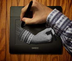
So this was my second attempt at recreating a M.C. Escher classic. I was always drawn to his art as a child because his art involved math and I was very into math as a child as well... Add to that the fact that he is Dutch and I'm part Dutch, and you've got a winning combination.
So last night I picked up one of these Bamboo Tablets and it seemed like the perfect subject for this type of shot. I wanted to replicate Escher's famous drawing of a hand drawing a hand, which is drawing the hand that is drawing it... and hold up, i'm getting confused.
So here is how this one is accomplished. This is essentially a combination of 2 shots... the background image is of the Bamboo tablet with me drawing on it. The second shot I used was of my hand over a piece of black poster board in the exact opposite direction... if you really wanted to I suppose you could use the same shot as the original, rotate it 180 degrees, but then your lighting is going to be WAYYY off. (well, 180 degrees off).
So now you have the 2 pics to bring into photoshop. (well i brought them into aperture first to correct some white balance issues, etc.) So as the background layer I use the bamboo shot. Next I copied the hand from the other shot (using the quick selection tool and some edge refinement) and I pasted that into its own layer in the bamboo shot.... Next I transformed the hand that would be coming out of the bamboo such that it was the proper size and rotation and positioned properly.
Next I took the eraser tool, and erased off the excess pieces of my arm in the arm/hand only shot, such that it ended just before the edge of the tablet's "active area". Once this was done I took the brush tool, turned the opacity to 50, gave it a pretty low hardness value and created a shadow under my arm and hand. I mad the shadow come out a little more the further I got to the right to give a greater sense of depth.
Next I created a gradient mask over my arm so it disappeared into tablet (while on the layer, choose the add a mask and create a gradient on that layer which fades from the start of the shadow area to the edge of the pad.
next I took the Pen tip in the Bamboo shot and copied and pasted into a new top level layer. this way the pen tip on the regular shot appears to be on top of the "drawing of my arm"
and finally, take the arm/hand layer and apply a "reticulation" filter to it. This is what gives the arm coming out of the tablet a "pointillism" feel... which is a nod to m.c. escher.
thanks for stoppin by,
Derrick
Friday, March 27, 2009
83/365 - the diver
so there goes one perfectly good piece of posterboard...
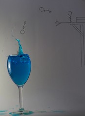
the original idea for this shot was that it was going to be a diptych (or maybe more than 2 shots) to shot the diver jumping off the diving board and into the cup of water. in the end i felt like it worked pretty well as a single shot... so here is how it's done.
First things first... draw all the background elements onto your ghetto lightbox (don't sweat it, posterboard is like $0.79). i would suggest drawing in pencil first and then going over top of that with a sharpie or something dark.
now it's time to light up your lightbox and take your first shot. better throw the cam on a tripod and trigger with a remote at this point because we want minimal movement between the shots... my first shot was set at f/14, 1/6sec exposure at 200 ISO (all shots were taken with my 50mm lens). The main purpose of this shot is to get the stick man's image as he is diving into the water...
The second shot is same type shot, but now with the glass of water in place (water had 2 drops of food coloring in it for dramatic effect). same camera settings for this shot as the last one, focused on the rim of the glass this time.
Now it's time to start droping objects into the water for the splash... this is a combination of camera settings, timing, and luck. The camera settings for this shot were (f/2, 1/800sec, ISO 640). Then I started dropping coins into the water and getting shots... the 6th or 7th shot turned out the best (hence the puddles of blue water on the base of the posterboard).
Now, clean up the mess you've made and head over to the computer. I imported the shots into Aperture and adjusted white balance and exposure such that the shots matched. I then exported the three shots into photoshop. The base layer being drawings along, the next being the glass sans splash, and the top layer being the splash. I made sure all the shots were lined up properly and then started doing some erasing. If I knew then what I know now, I would have probably tried to accomplish this with masks... I made sure to put a bit of a soft edge on the eraser so that it wouldn't look to harsh in the transition areas.
once i had everything looking ok, i did some blurring on the diving board to give it a sense of motion... then brought the shot back into aperture for some final touch up work, then posted to fickr... so there ya go... not so bad, just takes a bit o' planning ;-)
thanks for stopping by,
Derrick
Saturday, March 14, 2009
73/365 - angel
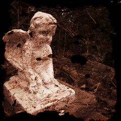
ok, so i've been seeing a bunch of photos recently that have textures applied... and i wanted to give one a try... but, i didn't really want to go scrounging the internets for a texture... i wanted to make my own ;-)
so first things first, we need a photo to lay the texture onto. So I went out into the yard and grabbed a shot of a little angel statue that we have laying out in the pathway in the backyard. I felt this would work out well just because the paint on the angel statue is flaking off giving it a decaying look already... and i felt the texture i would be adding would add to this look.
I imported the shot into Aperture and cropped and made some small color adjustments.

Next I needed a texture. So, I took a piece of tissue paper that I had bought for my "ghetto lightbox" and rolled it up and burnt the edges off... then i rolled in the other direction and did the same thing. now i scrunched up the tissue paper and burnt sections... this gave it some holes in the middle of the paper, plus a real rough look. Once I opened up the tissue paper i burned a few more sections of the paper to make sure there weren't sections of the paper that were completely void of burns, then i laid the sheet out flat on a piece of black poster board and took a shot of the burned tissue paper.
I then imported that into Aperture and adjusted the black point such that the black poster board became completely black.

OK, so now we have an image... we have a texture... time to put them together.
Open up your base image in Photoshop (in this case, it is the angel) and then open up your texture image. Select all of the texture image and copy it to the clipboard. Now go back to the base image and create a new layer. Paste your texture onto this layer, then go to the free transform (in the edit menu) and then resize your texture image to lay over the complete base image (you should now not be able to see the base image).
Now, in the layer properties, choose to change the layer from "Normal" to "Overlay" (or soft light, or hard light, or whatever... time for you to experiment). In this case I did the Overlay and then i duplicated the layer to intensify the effect...
and that's it. That all it took (it's fairly easy, regardless of how difficult i may have made it sound).
Enjoy workin' with textures. (and make sure to go to this tutorial by aknacer. for the vid that showed me how to accomplish this).
Have a great weekend!
Friday, March 13, 2009
72/365 - stuck inside the color wheel
Pretty simple picture to do, provided you have the right tools (or is that toys)...
Step One: Create a blank picture in a some image editing software.
Step Two: Create a colorful gradient fill in that image.
Step Three: This is where the toys come in handy... hook your computer to a projector and display your picture full screen.
Step Four: A wide angle lens is helpful because you want to set the camera up close to the screen and fill as much of the frame with the color gradient as possible.
Step Five: Time to take the photo... stand between the camera and the projector to project your shadow onto the screen, then take the picture with a delayed timer (you want your hands in the shot, don't ya?)
Step Six: In your fave editing software crop out the excess and angles that will be introduced due to you not necessarily filling the frame.
Step Seven: Bask in the glory that is your photo!!!
Monday, March 9, 2009
The Quest for the Blue Heron and/or Crane Shot

As some of you have been keeping up with me on my flickr page may have noticed as of recently, I have become obsessed with getting a shot of a crane that has taken up residence on the creek that runs behind my house... luckily for me, my neighbor caught this slightly embarassing obsession on camera...
 I was sitting on the pictured ladder for about 45 minutes trying to get a shot of one of the Blue Herons that were hanging out on the creek flying towards me... got a couple shots of some Canadian Geese, but that was about as good as it got this evening... I shall get a shot of one of those cranes (not pictured) before the end of the year... that is my promise to you!!!
Thursday, March 5, 2009
64/365 - trapped
fairly quick little blog entry here...
the shot of me pressed up against the screen of the mac was actually taken of me pressed up the screen of my hummer... used a circular polarizer to lower the glare a bit and a black jacket was held up behind the camera to reduce glare more. triggered the shot with remote.
then brought the picture into apple aperture, enlarged to full screen mode, then took second shot of me trapped in the macbook.
changed to monochrome due to the multiple white balances that were causing issues (if i white balanced for the laptop i was BLUER than the Cookie Monster; if i white balanced for the me, the macbook was a dingy yellow.) oh well.
Subscribe to:
Posts (Atom)